16 Feb Design Transformation: Spa Bath Retreat Pt. 1
Recently, we received a call from a woman and she said that she would like to talk to us about a new home that she had just purchased. She told us that it was about 8 years old and she had been looking a long time to find a home that met all her requirements and that finally this house did. Many of the areas she said only needed minor changes, along with new furnishings. The master bath was a different story. She said it was terrible and had lots of wasted space and she felt we would need to completely tear it all out and start over.

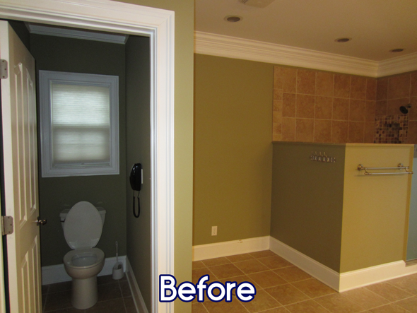
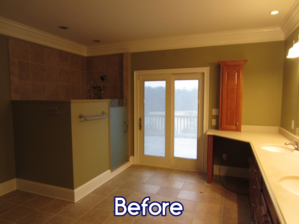
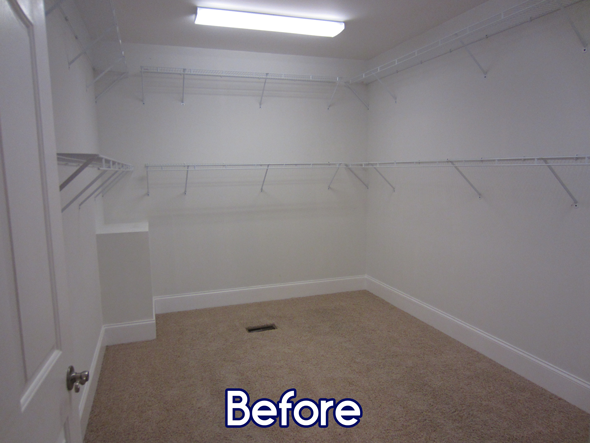
Now, many times, I have clients tell me that a room has no hope and that they believe that everything must go. And yet, when I see the room myself, I am able to see how, with a few changes that we can make the room look great and function well. This is NOT one of those times. When I arrived, I finally understood what she was talking about. But first, let’s talk about the positive things about the space. The master bath space is very large space. Tall ceilings and a nice crown molding throughout. The toilet is sectioned off for privacy in its own room and there are sliding French doors going out to a private deck, overlooking her property. So I have a large space with two nice features. And on top of that, I also have a large walk-in closet to work with as well. After that, what was left is either inadequate or just plain bad!

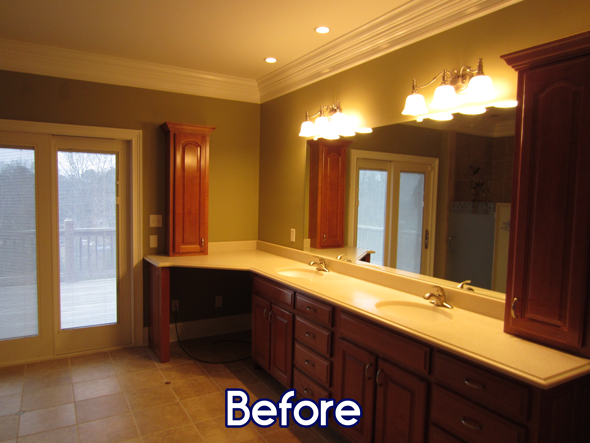
First, the master bath suffers from poor lighting. There are a few recessed lights scattered around and two wall mounted sconces over each sink: not nearly enough light for general lighting and certainly not enough lighting at the sink space. Next, the cabinetry is set at a lower height then we normally do today. This is not a comfortable height for most people. The awkward layout with a deep corner space also looks odd and is a complete waste of space. Then we turn our attention to the other side of the bath.

I do not know what the thought process was when this part of the bath was designed. The shower features a half wall that , while allowing the bather a view, does not do an adequate job of keeping the water spray inside the shower enclosure. Perhaps more puzzling is the area to the left of the shower. Was this originally for a tub? An area for a vanity makeup area? No matter the reason, the area is empty and looks like an afterthought.

As for the existing finishes and materials, they do not meet with the new owner’s vision of having a bright and airy bath. The dark stained cabinetry and the army green walls, along with the brown tile do nothing to brighten what is already a dark space. This is not the dream bath my client had in mind. She envisions a master bath with light colors and a soothing feeling. She needs a sit down makeup area, a tub for long soaks and a large shower with multiple shower heads. She wants her new bath to be a relaxing getaway from the stress of her daily work. She can see herself having a cup of coffee on the deck and enjoying her view. As for her closet, she needs lots of room and organization for her clothes and wans an island for easy packing and more drawer storage.
So I have a challenge ahead: making an awkward space feel like a spa retreat and giving my client her dream bath with the light and airy feeling that she desires, all while having the functions that she requires.


No Comments